
Chalk & Salt
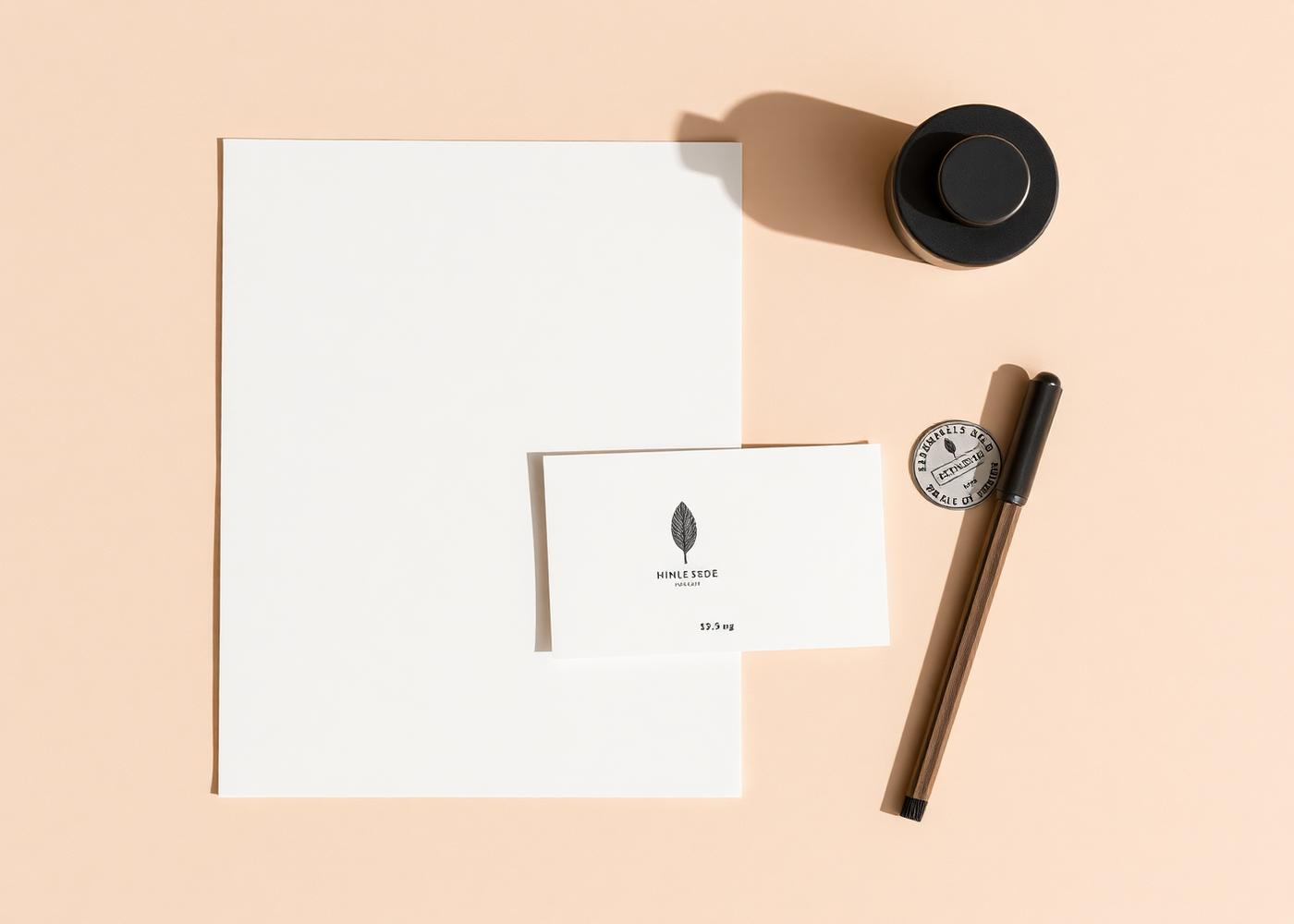
A complete identity for a small-batch sea salt producer, stamp, stationery, packaging and the rules to keep it consistent.
- Category
- Branding
- Year
- 2025
- Services
- Brand direction, Logo design, Typography, Packaging concepts, Guidelines
Overview
Chalk & Salt harvest and dry sea salt in small batches. They were selling well at markets on the strength of the product alone, with labels printed at home.
Challenge
The identity had to survive being hand-stamped onto kraft boxes, screen-printed onto glass, and reduced to 20mm on a jar lid, without losing its character.
Approach
We built the mark from a single geometric stamp so it works in one colour at any size. Type, layout and paper stock were all chosen for how it behaves in the real world.
Design
A restrained palette of chalk white, wet-stone grey and a warm sand. One grotesk family across the entire system, with a wide letterspaced treatment reserved for pack fronts.
Outcome
The range moved into independent food shops across the South West with packaging the owners can produce themselves, and a short set of guidelines that actually gets used.
“SUMWEN took Haunted from an idea into a brand and platform that actually feels like us. Chris handled everything from the identity and website through to the app, graphics and ongoing creative work. What stands out most is that he doesn’t just make things look good, he thinks about how they’ll actually work and how people will use them.”